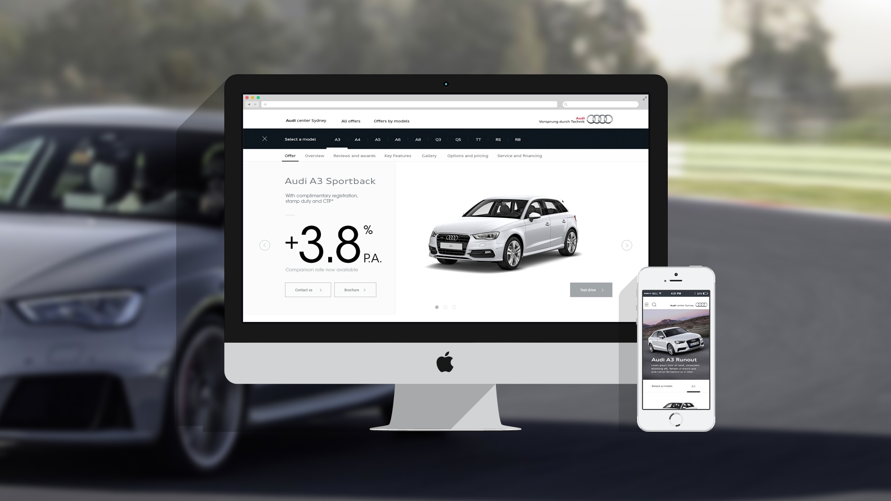
AUDI RETAIL OFFERS SITE
A platform that allows a customer to learn about retail offers and explore models features
The project
brief
We were briefed by Audi to create a CMS site that allowed customers to explore and learn about retail offers.
Previously individual microsites were created for retail offers, creating a complicated inventory of sites that was both hard to manage and expensive to maintain.
Constraints and Challenges
Being built in a CMS, the site had to have reusable templates that could be applied to all types of offers and vehicle groups.
The site also had to clearly articulate savings and offers, whilst maintaining the premium Audi brand positioning.
We also had to future proof the site structure, and keep it shallow. This online property would eventually be integrated into the Audi site ecosystem, which added extra considerations around the site map.
The Solution
From the in-depth research, we realised that retail is more than just the offer itself. With high-involvement and high-cost risk products, the benefits of the product also have to be articulated clearly to further convert sales.
Our CMS site not only featured model specifications and benefits, the purchase options, such as warranty and financing, were also featured to address the holistic purchase cycle. In this case, the messaging priority was offer/price, then features, purchase method, and post-purchase benefits.
my role
As the UX architect, I was responsible for the customer experience and UAT. I designed the user experience, informed design decisions and completed UAT with developers.
THE UX PROCESS
01/ Proposal
Documentation was created for client approval, defining our UX approach, objectives, reasoning, timings and costs.
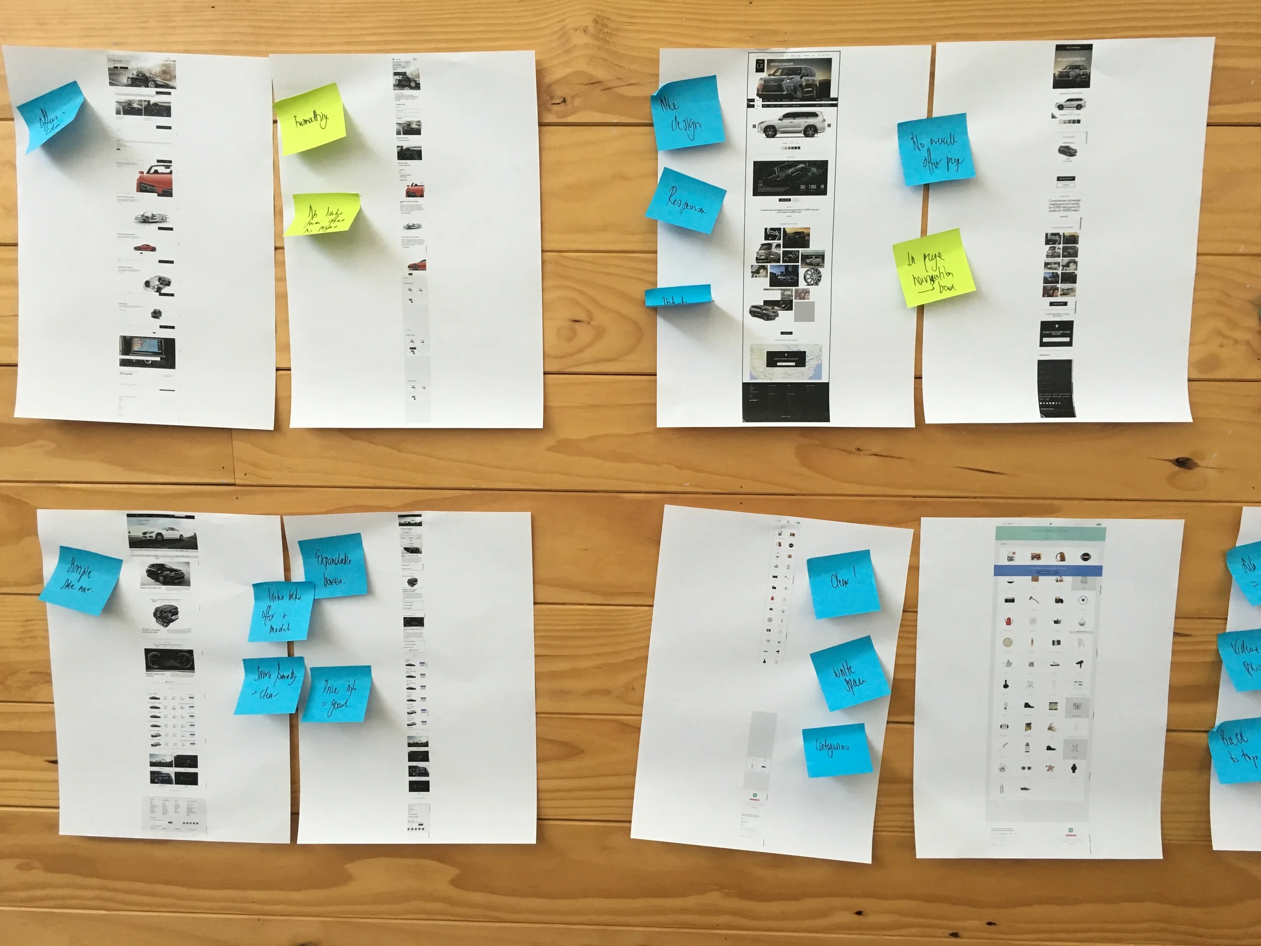
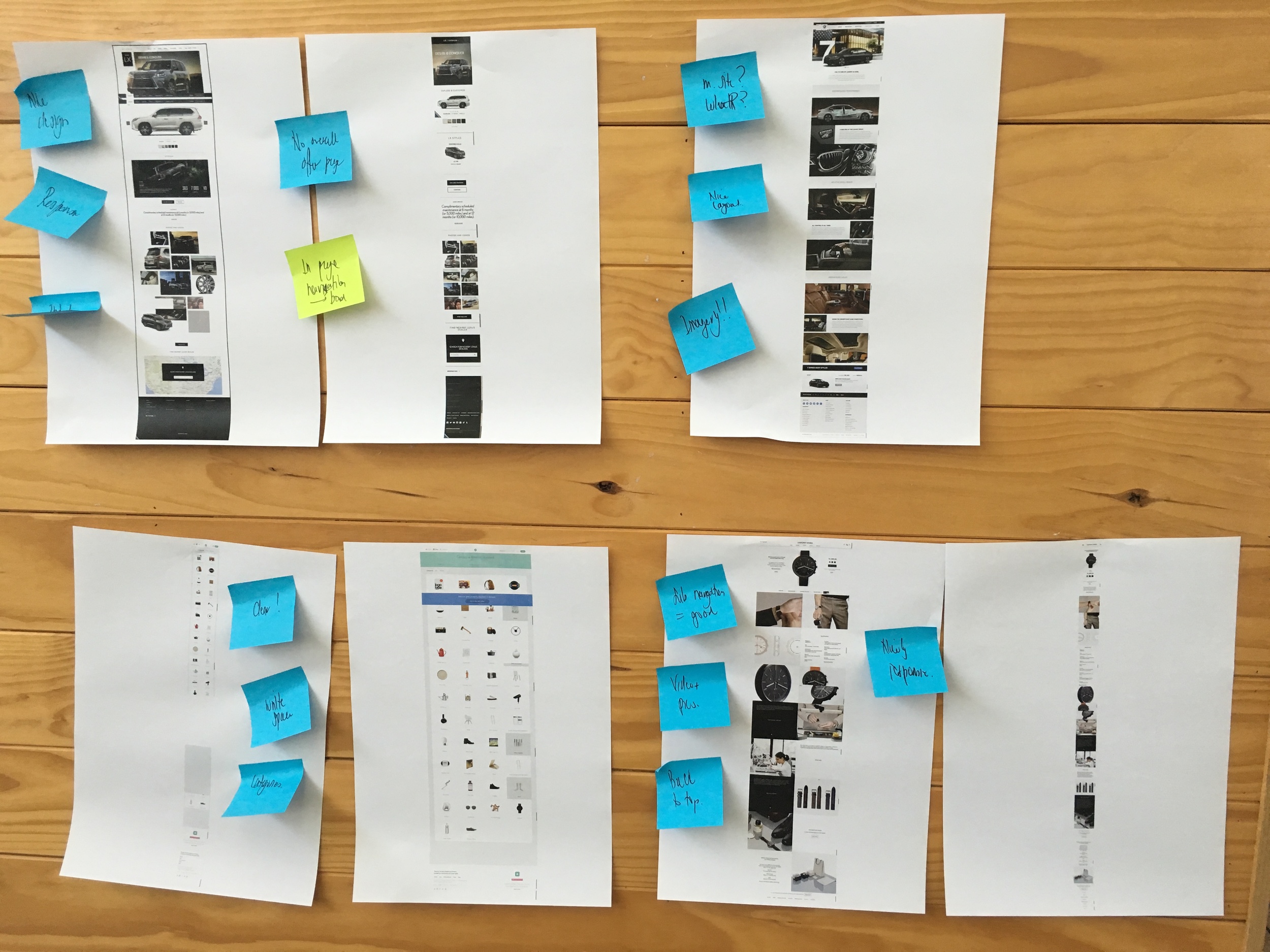
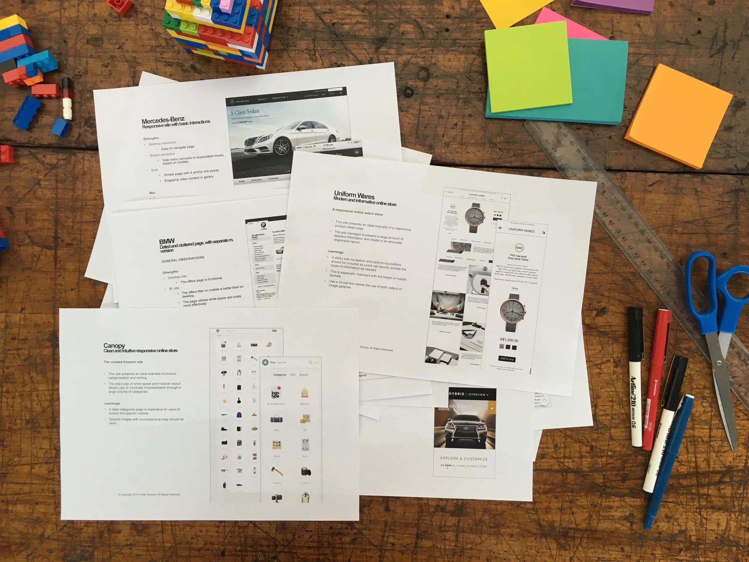
02/ Competitor and best practice review
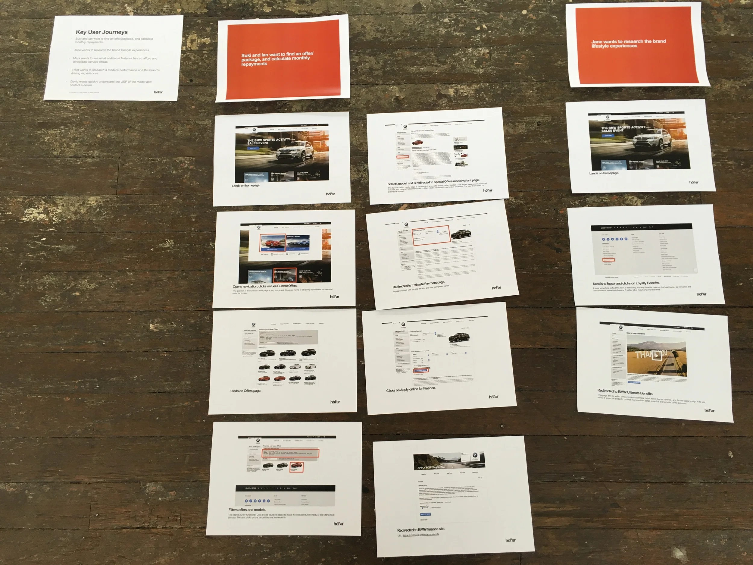
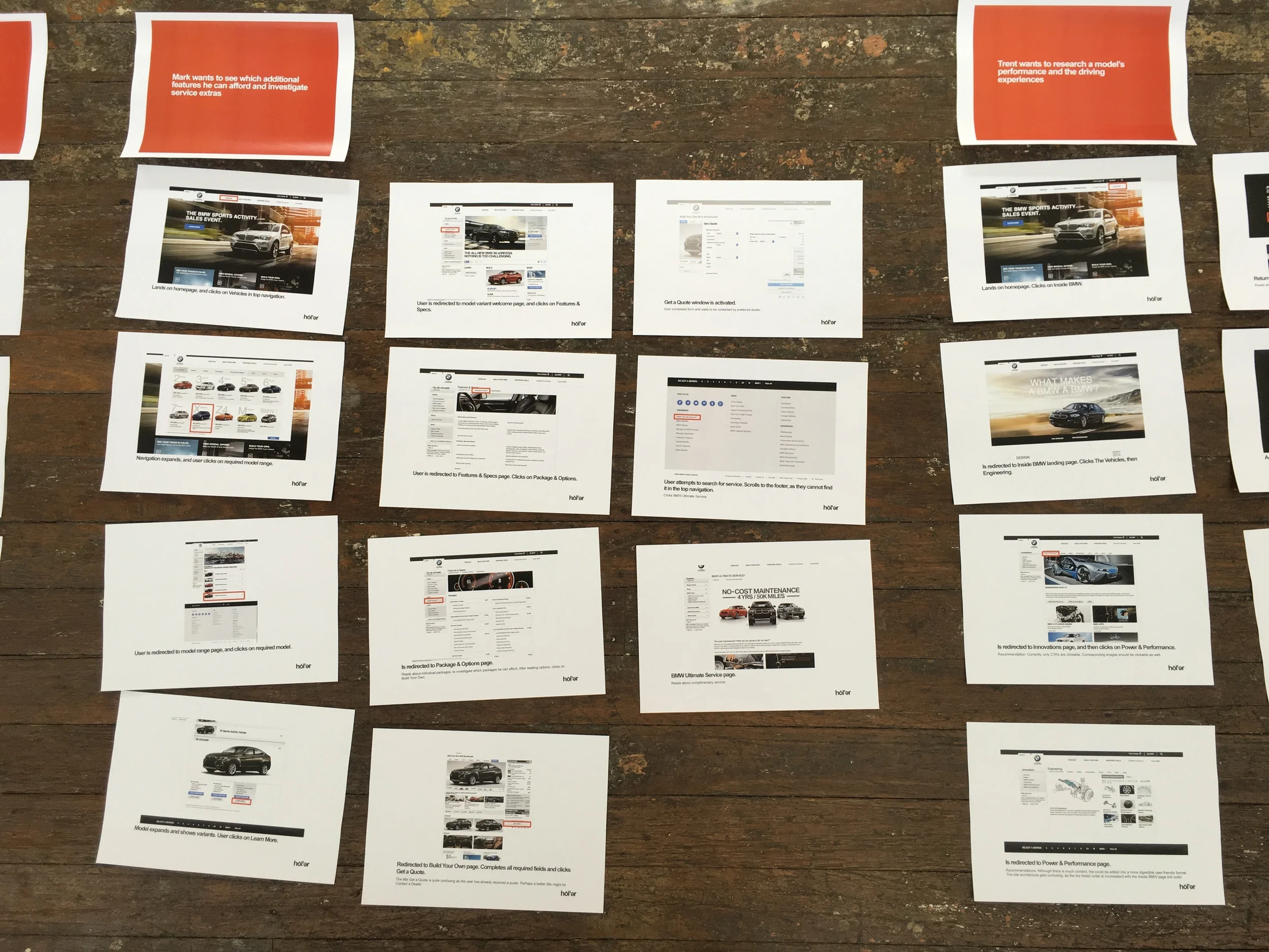
Offer pages of competitor and best practice retail sites were evaluated. Insights and recommendations to activate the discerning Audi customer were provided.
03/ Refined personas
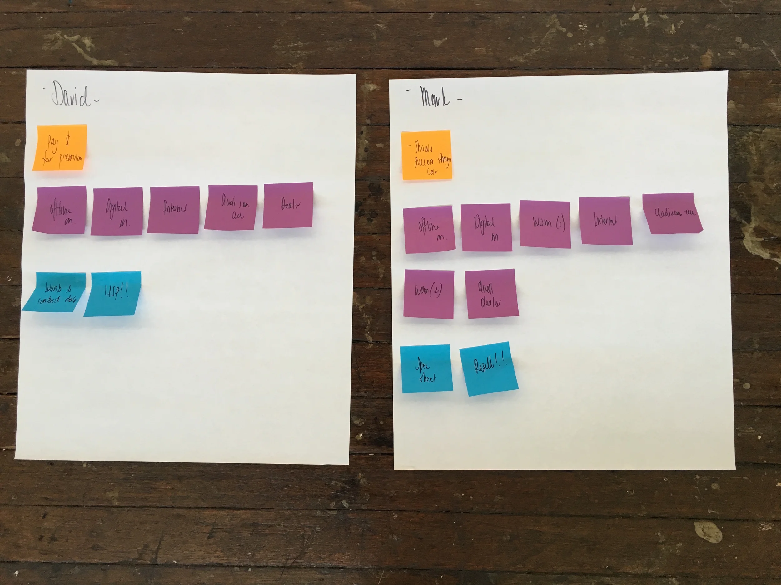
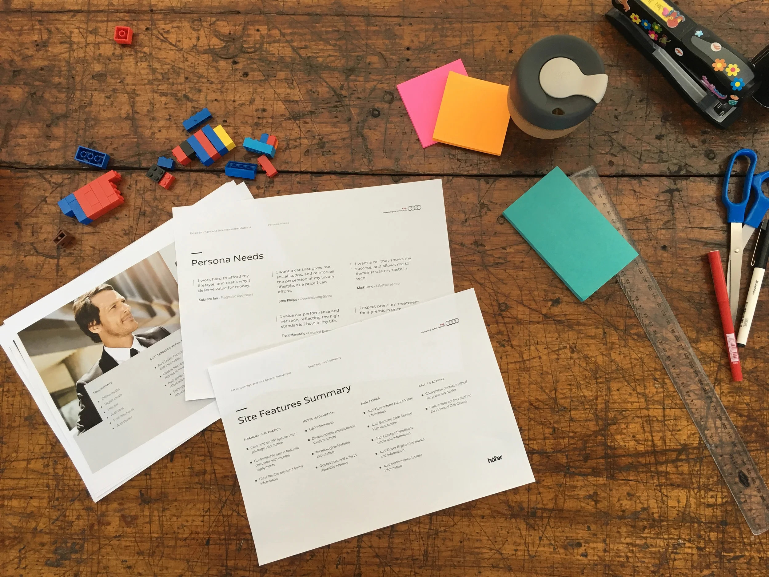
A stakeholder workshop was run to examine and refine the existing comprehensive Audi personas, under a retail lens and with a focus on price elastic customers.
04/ Brand experience blueprint
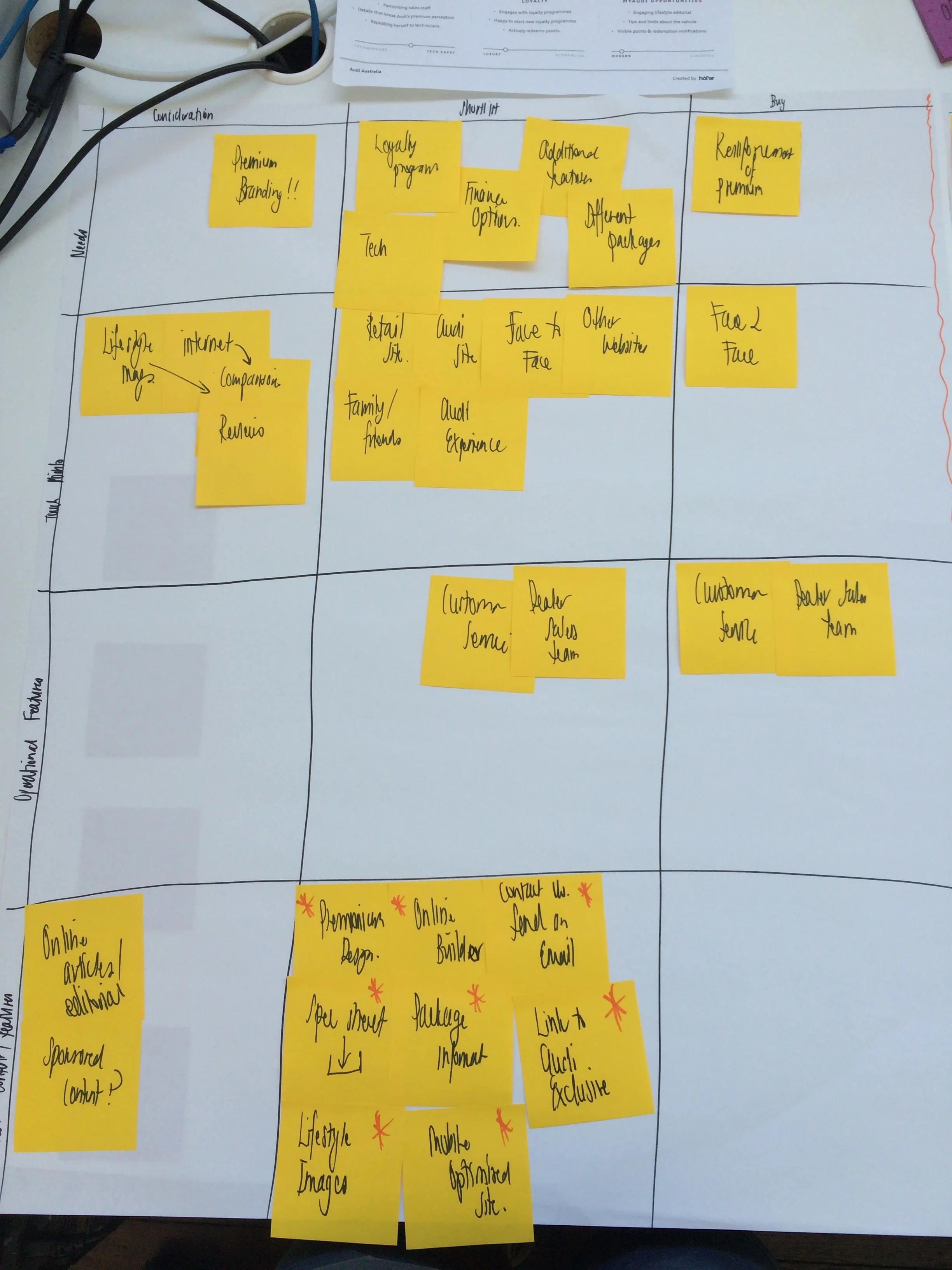
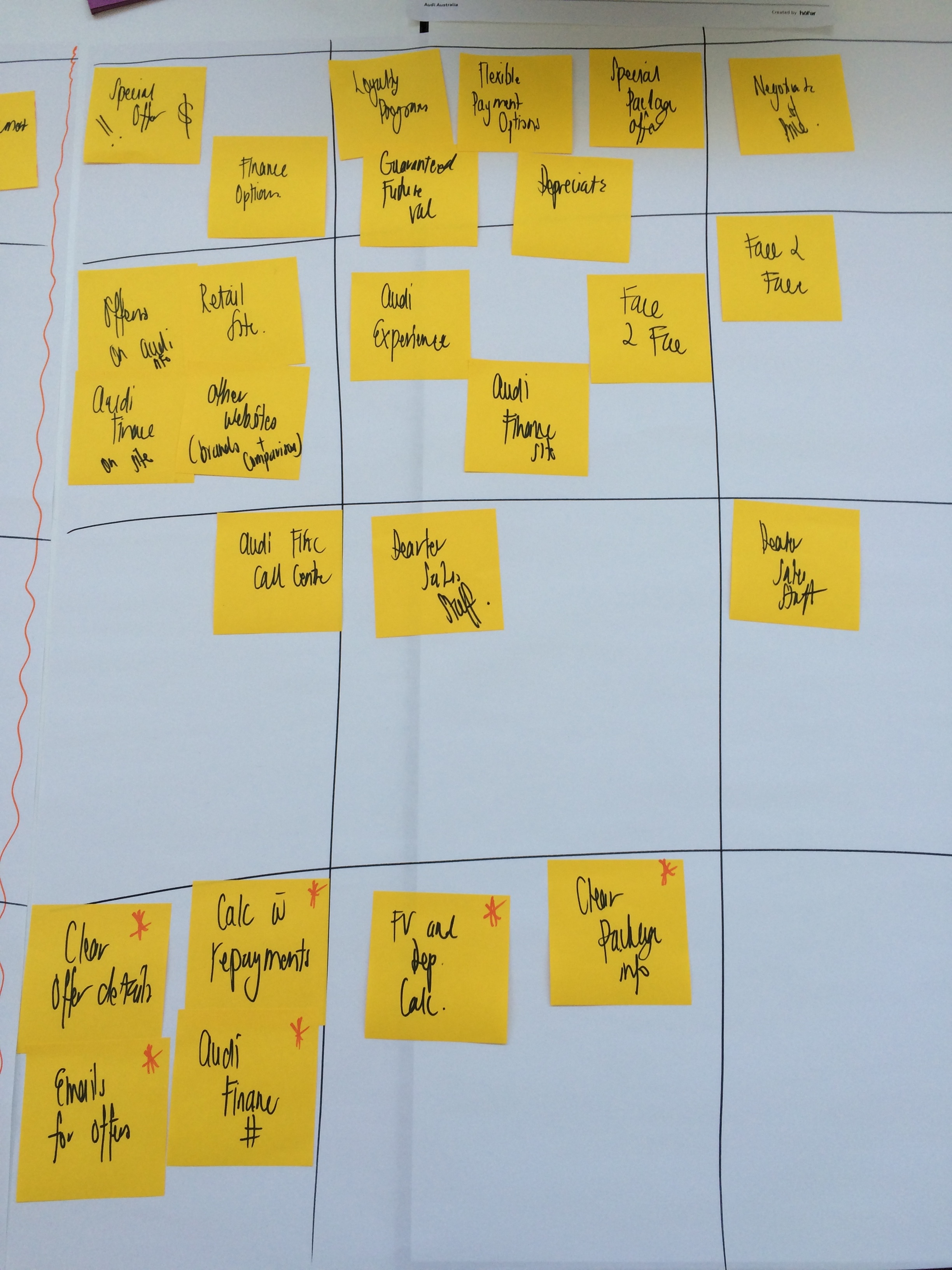
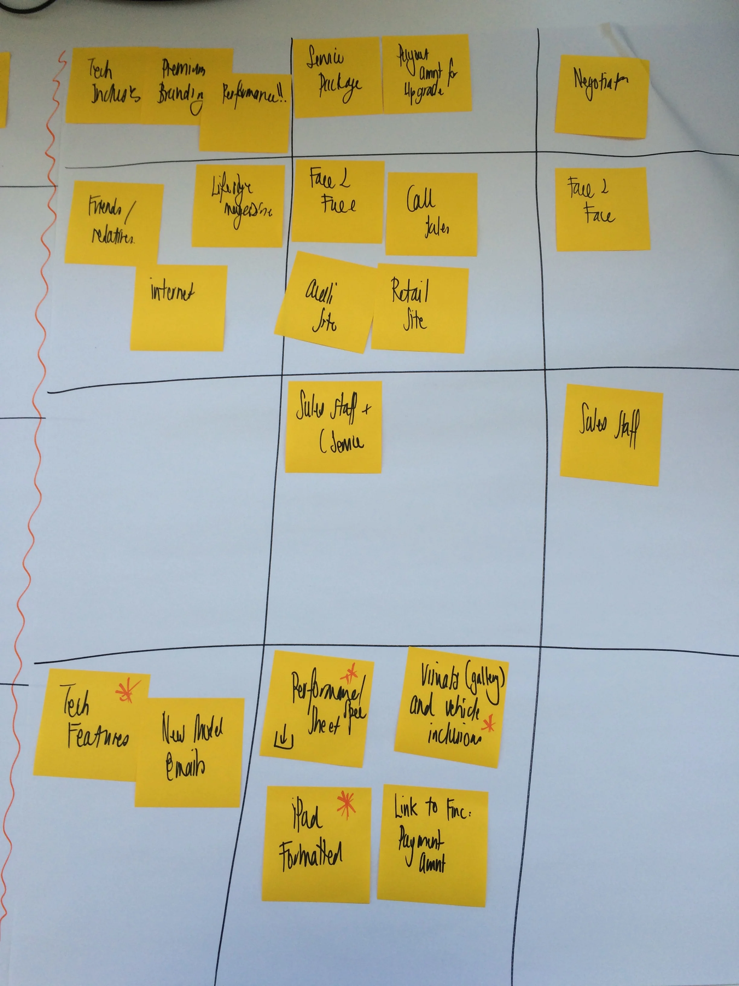
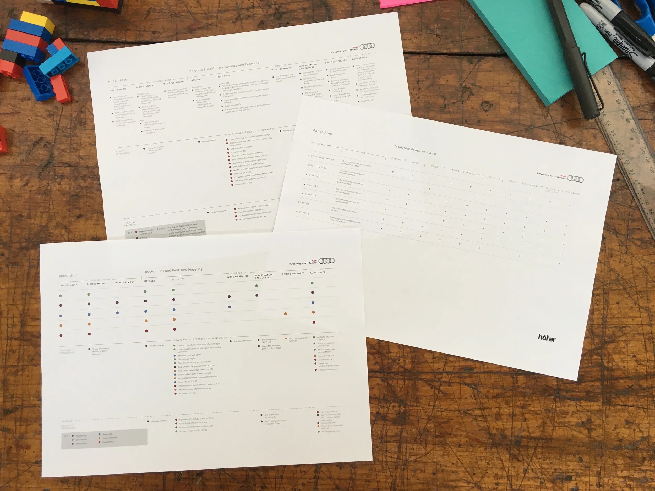
Complete brand experience journeys were created for each of the personas. Each interaction and touchpoint was evaluated by its effect on brand equity.
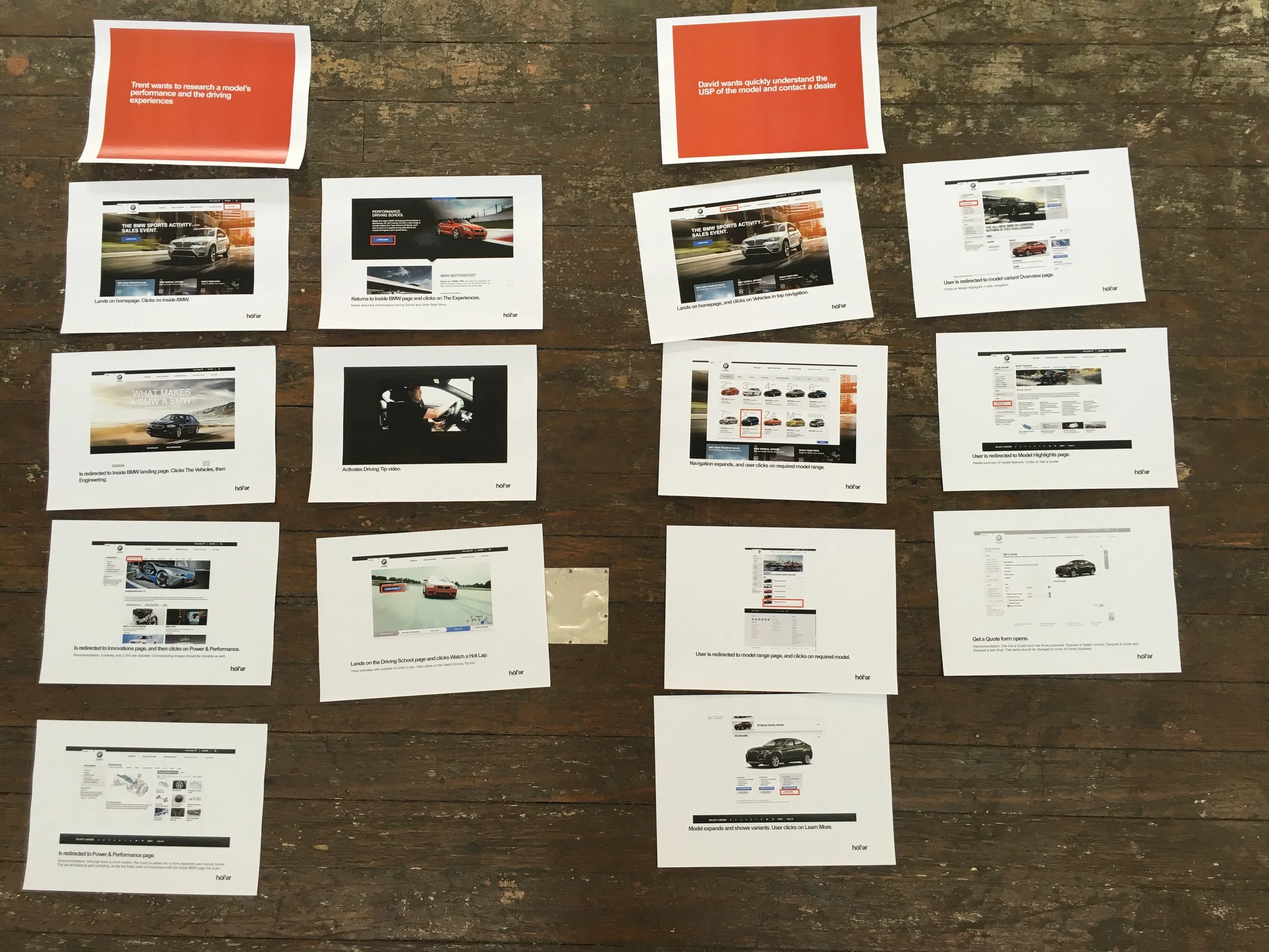
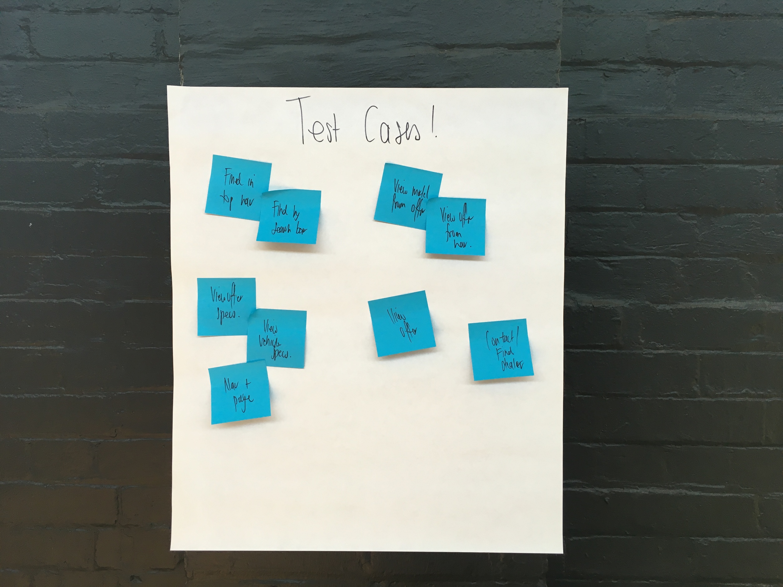
05/ User stories, tasks and goals
User stories were created to identify the minimal functional components required for users to accomplish said goals.
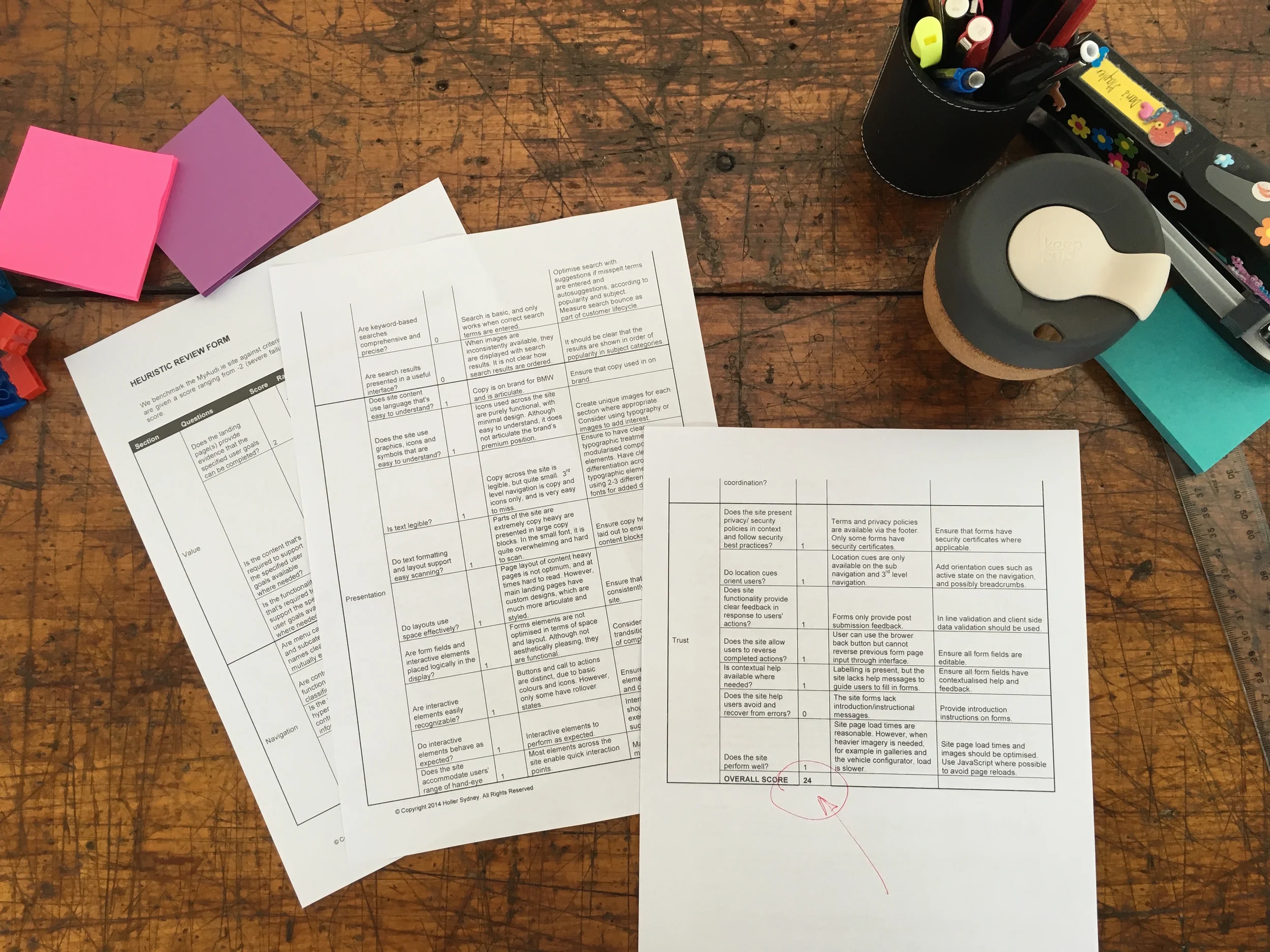
06/ Heuristic review
A heuristic review was executed to score our main competitors retail sites. This allowed us to identify possible advantageous improvements and issues, which we could apply to our retail site.
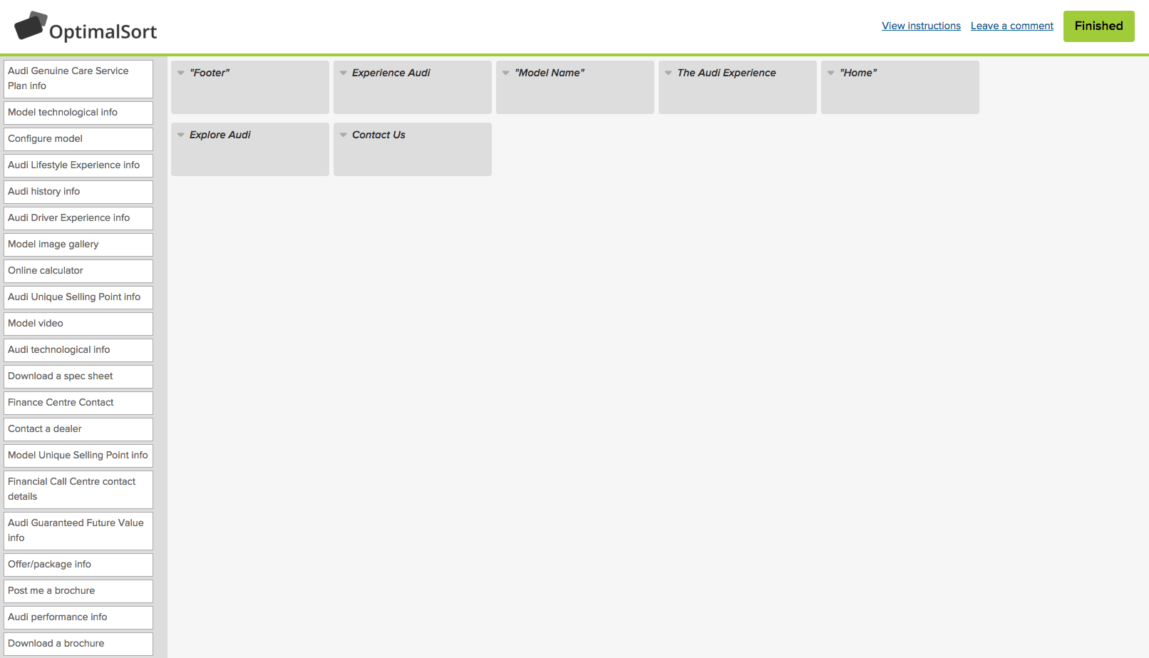
07/ Card sorting and site map
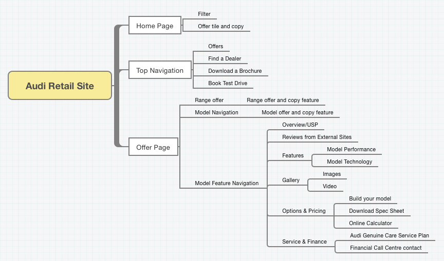
Once we confirmed the necessary content required on our site and reviewed site statistics, we ran a workshop, using Treejack. We established the IA organisation and ensured an intuitive taxonomy, which was detailed in a site map.
08/ Sketches
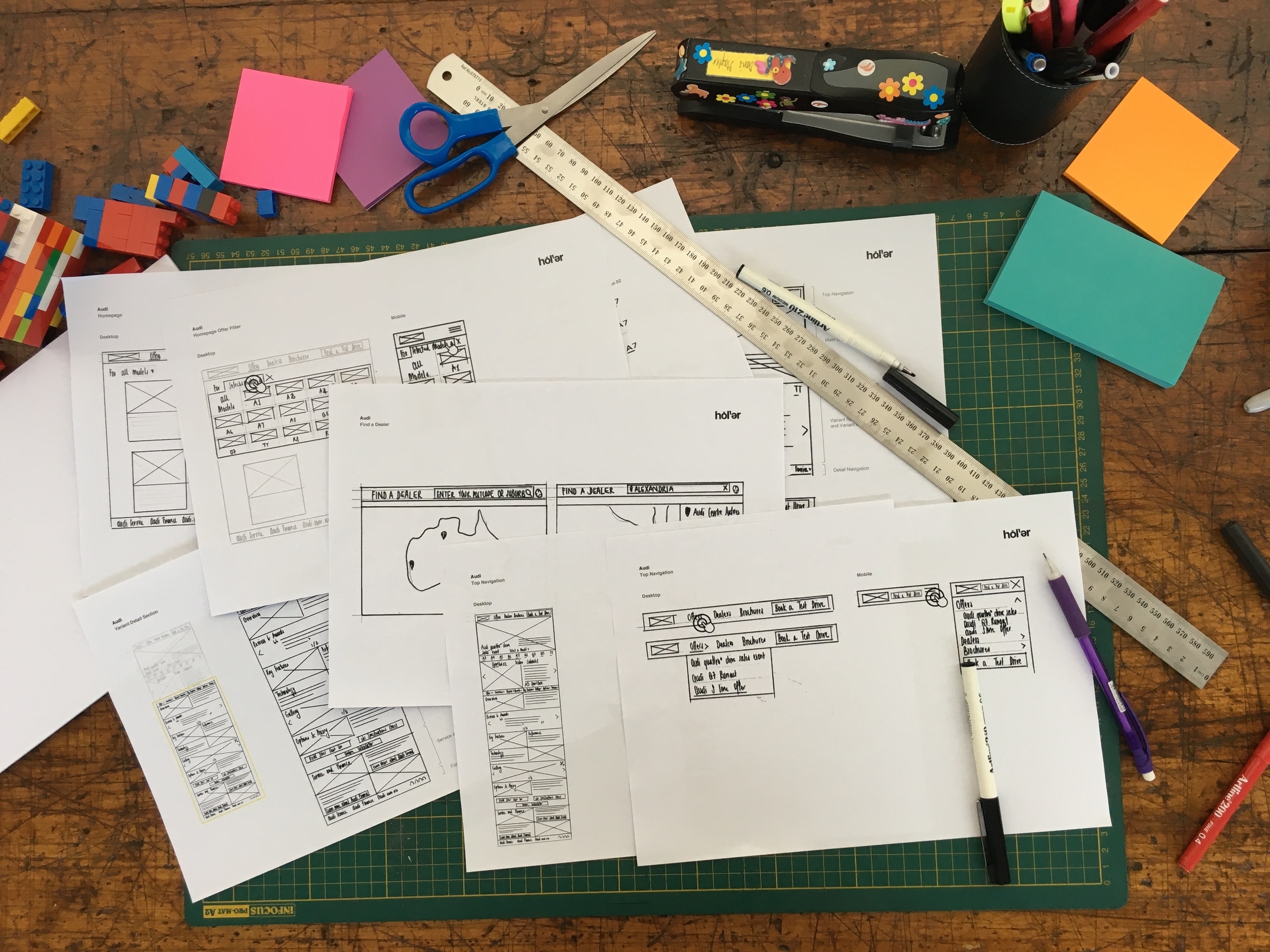
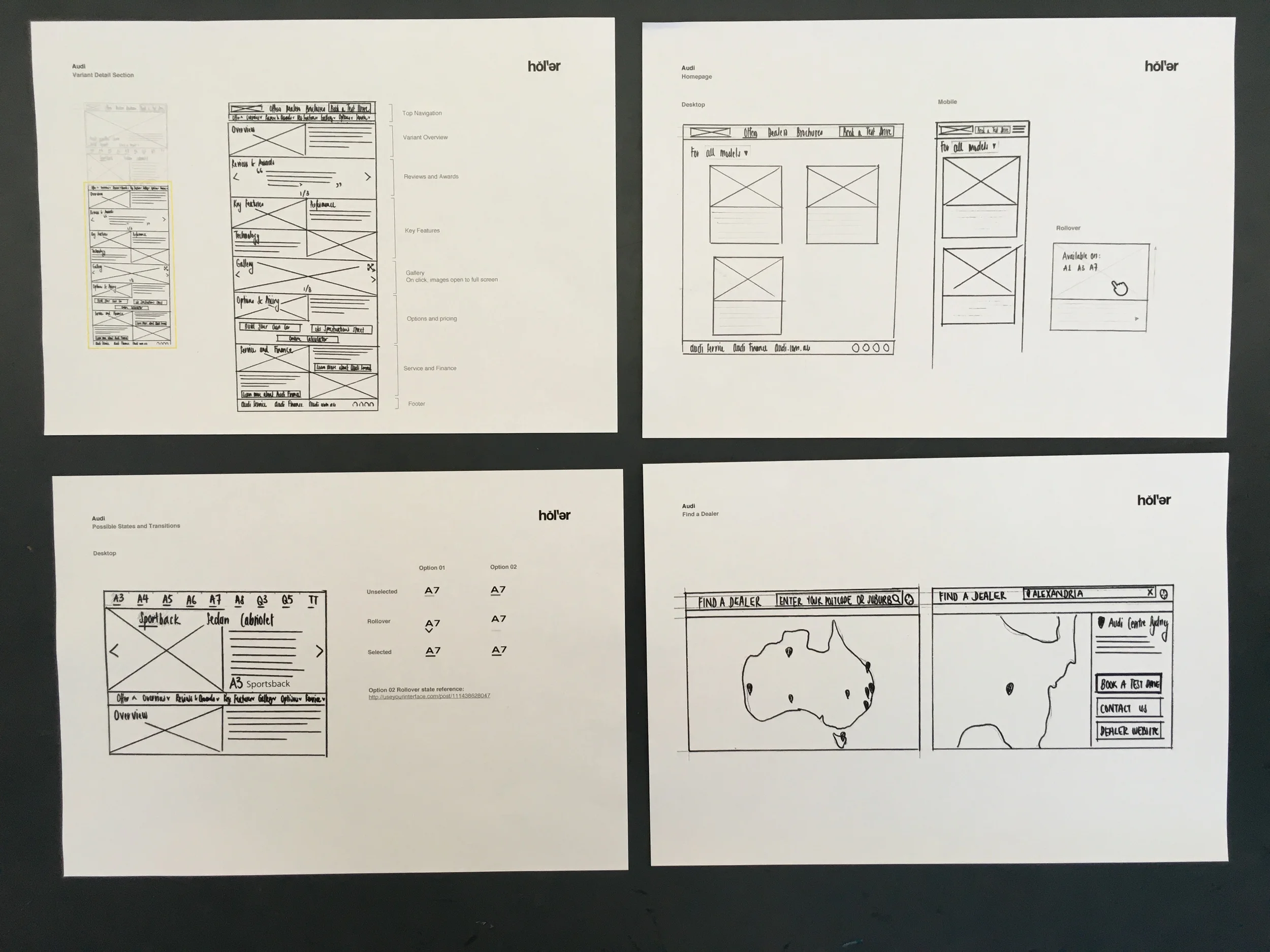
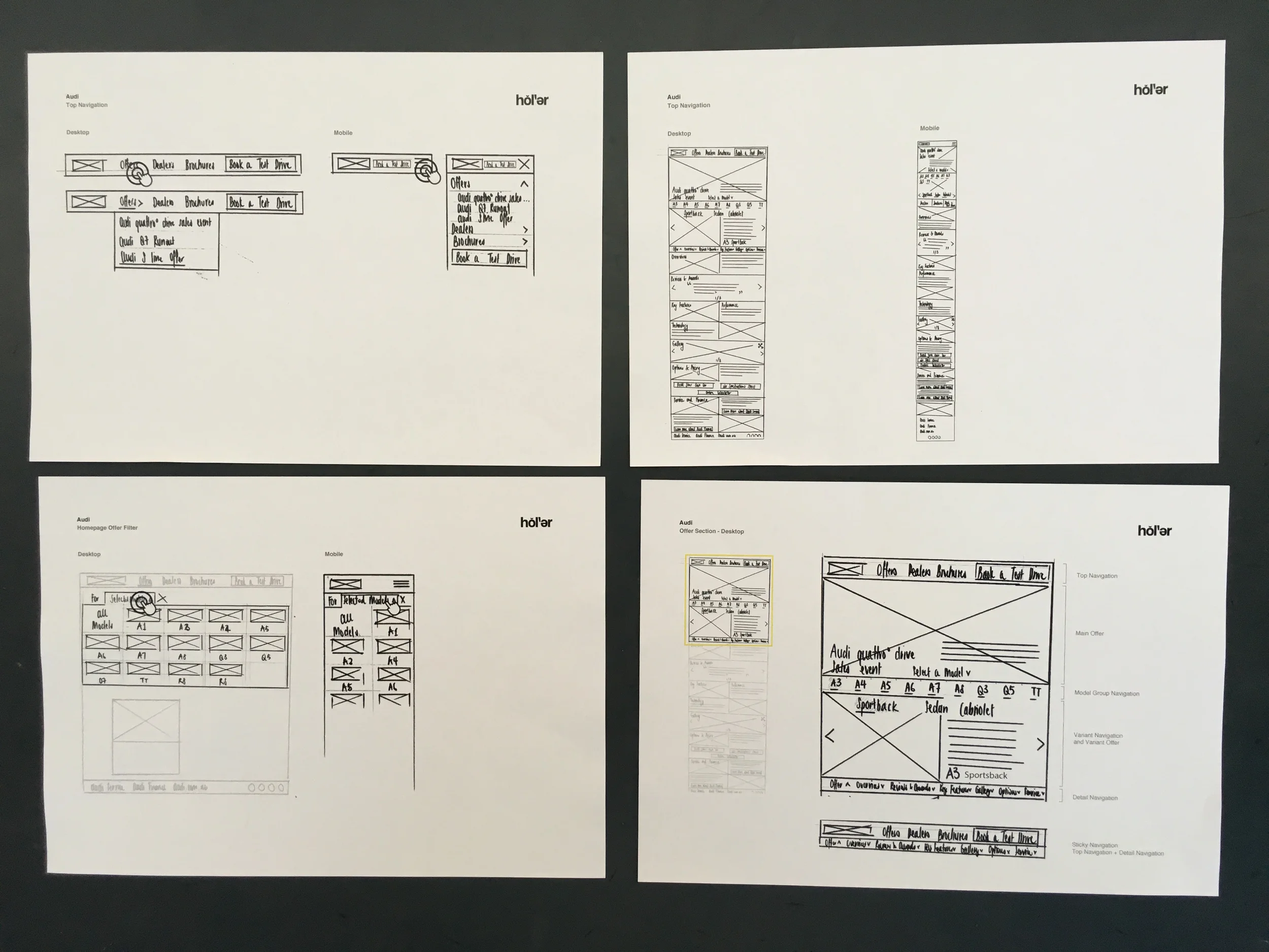
Low fidelity UX sketches were created, with feedback from the design team. Sketches included layouts of content, page features, possible transitions and design patterns.
09/ Interactive wireframes
Created in UXPin, responsive interactive wireframes allowed us to obtain feedback on site layouts. By testing contents and options, we were able to confirm the effectiveness of interface elements and navigational systems.
10/ Annotated wireframes
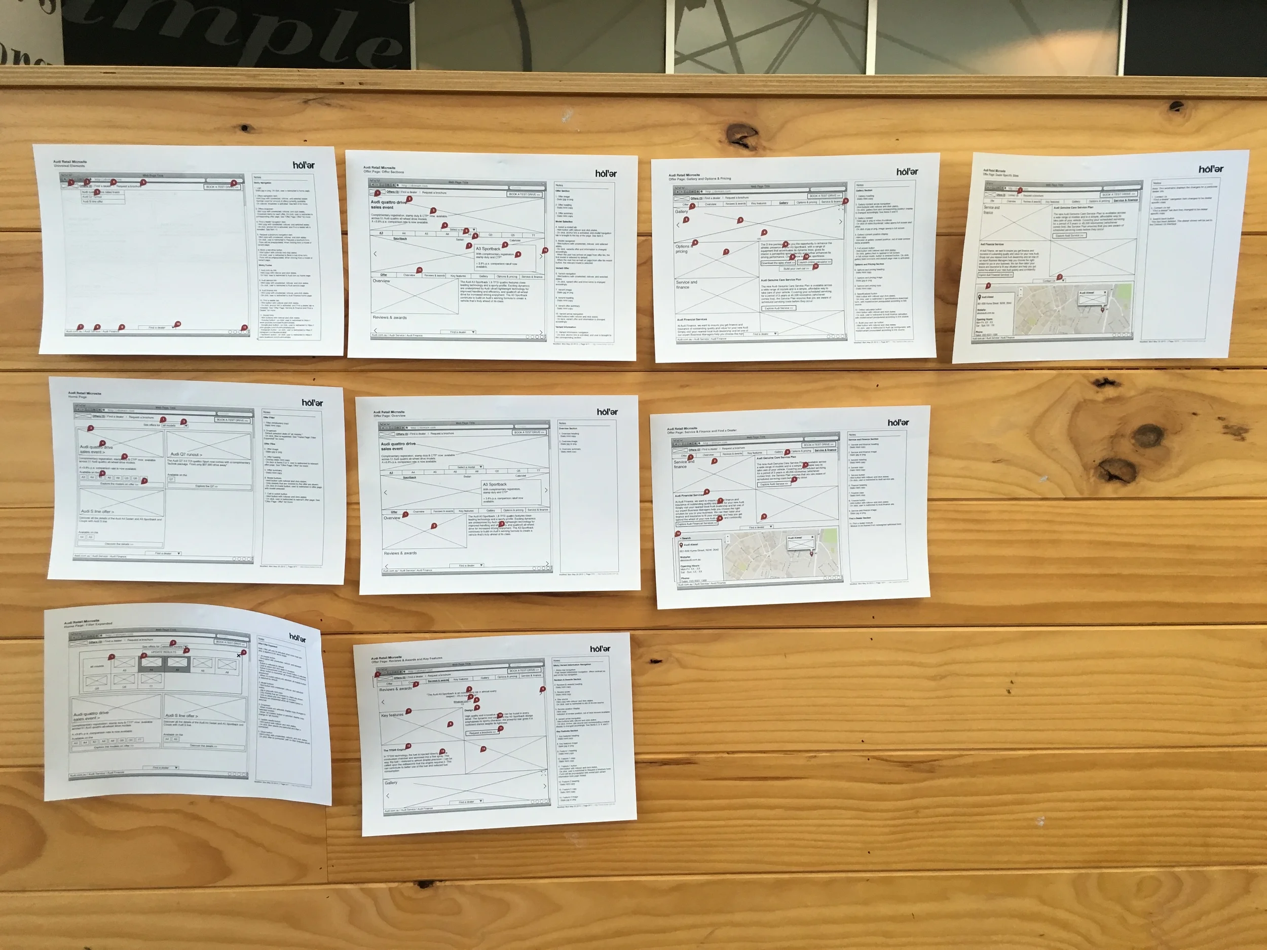
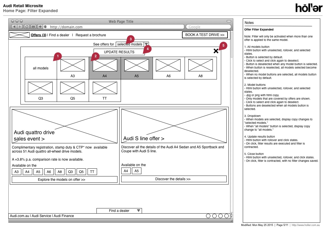
By annotating the wireframes, and working with developers, we provided a document that allowed timings and costs to be confirmed for the production phase. It also clearly defined all interactions and behaviours for future reference.
